Tuesday, 30 April 2013

Story Board,original, made changes

We all worked togrther as a team to plan out a story board. We made a really quick draft story board first in case we wanted to add/change things and then decided on the finished piece.

I drew out the proper, more detailed draft of the story board. I now have it properly stuck onto a sheet with directions. We made lots of changes so we could finish it in time!
 Here is the storyboard:
 
Shot 1
Opening. Miramax Production fades in and ut of a black screen 
 
Shot 2


 Almost like a written introduction "Somewhere in Las Angeles ...." fades in and out of a black screen
cut this shot out! 
Shot 3
 Two main characters are walking down the street
 
Shot 4  
 Suddenly stop to shoot at something. Credits from the shooting.
Cut! Insteaad the credits will come out as they walk past 
Shot 5
 Continue walking to the Jack Rabbit Slims diner
 
Shot 6
 They find another main character and start dancing
 We also changed this scene slightly, Animating the dance took too long so instead the two characters stand on stage with their trophy
Shot 7 
 Uma Thurman in the bathroom, bends over to snort cocaine. Her name appears behind her and she lifts her head again. Passes out. Screan turns black.
Cut!!
 

Strange basement scene. Willis and Marcellus tied up
                                  We decided to repace these three shots
with a simpler less revealing (and odd) one
Shot 8 - Bruce Willis sitting in the bar and
our two main characters walk behind him
      
 
 Rotates to view the Gimp...weird!
 
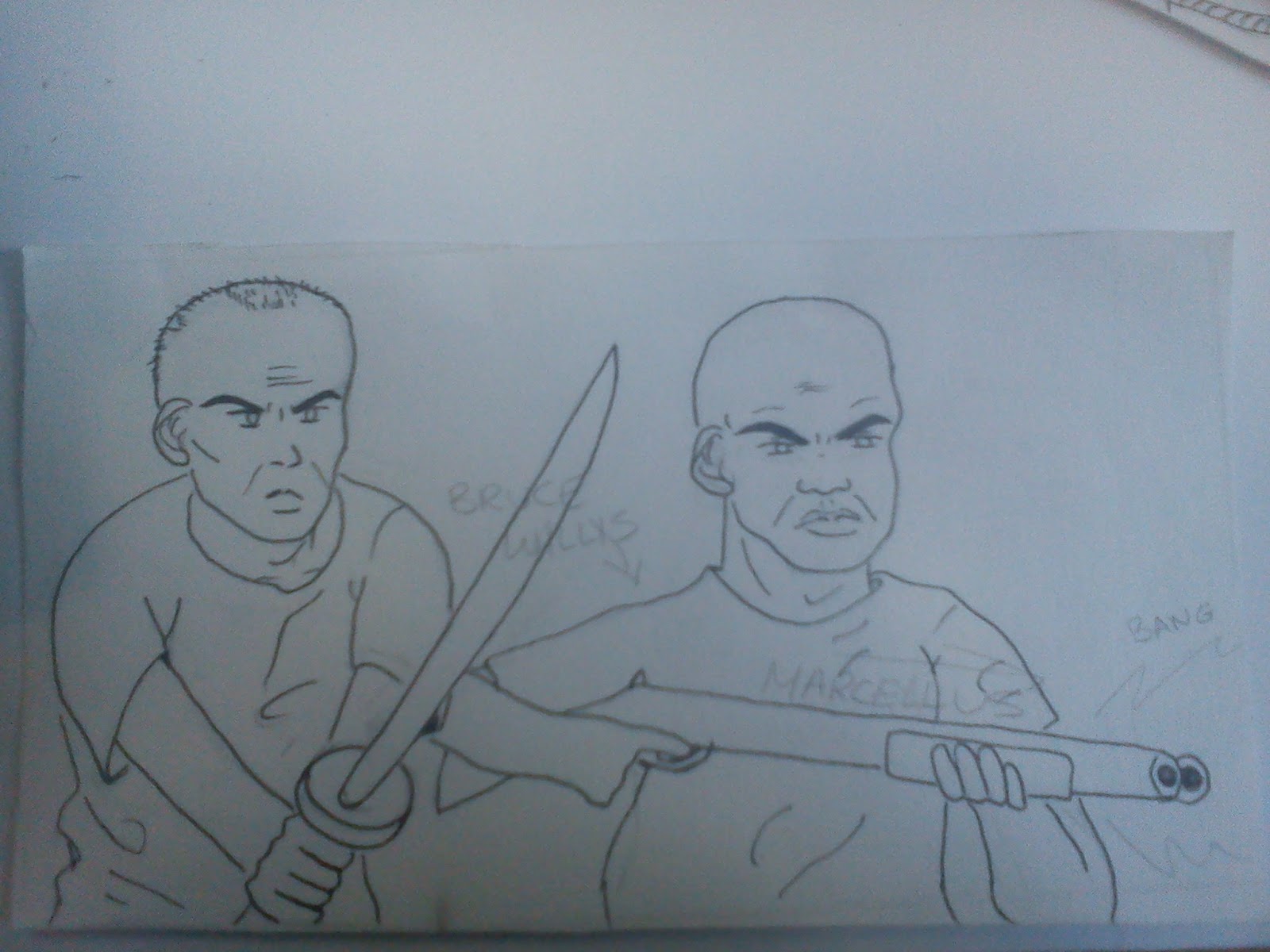
Rotates again to view the untied and armed willis and Marcellus. Marcellus appears from behind Willis, also the credits appears with him. Marcellus shoots, screen turns red.

Shot 9
 two main character continuing their journey. Are now at Hawthorne Grill diner

Shot 10
Walk through the diner, passing the english couple while also revealing the credits as they pass

Shot 11
Samual L Jackson hands out his iconic wallet
 
Shot 12
Pulls out a dollar and on it is the Director, Tarrantino, name and face

Shot 12
And finally appears the title
 

Friday, 26 April 2013

My job for the project... Background!

My task for the animation is drawing the backgrounds, scan them, and put them into the animation software, probably Photoshoop. Oscar will then animate the characters digitally in the middle ground.

I have decided to draw the background in a simple animated style, not overly realistic or else it will clash entirely with the characters. Jessica is in charge of the text and audio but felt it wasnt a big role in the animation so I decided she could help me with the background for now. My only concern is the risk that our styles could be entirely different, so we will compare and decide what to do later on.
The task of doing all the backgrounds was returned to me except for the street scene because Jessica had her hands full with text and audio. Now I just have to worry about getting it all done on time....Which I will of course!

Reference Images of Los Angeles where Pulp Fiction was filmed

I found this website where  many of the scene locations from the film were tracked down and photographed, many locations remained the same since the film was made and others have been changed or built on. Handy resource!


Jack Rabbit Slim's diner where the John Travolta dances with Uma Thurman


Hawthorn Grill, inside and outside, where the film begins and the english are and try to rob the place


The somewhat strange basement scene. Dark lighting, yellow/orange/brown colours
 

Thursday, 25 April 2013

Research Images

These are some research images I found interesting and might be of help in the future of making this project. I found these when researching for our mood board but obviously couldn't use them all.

 
 Really interesting drawing style. Love the use of shadows and drawing style.


 For the basement scene these are the scene shots in the film we would like to imitate/ manipulate. In these pictures I was also looking at the lighting. I realised throughout the scene that a majority of the upper corners and partly the lower corners are darkened. Gives the scene a more sinister atmosphere. Perhaps this use of lighting will be useful?
 
A famous scene from the film, striking, face on, interacting with the audience.
 
 I decided to look up other gangster films for ideas and realised that the diner scene is a common scene in various films
 
 The Diner layout, colour palettes. Browns and cream colours
 
 Poster for the film, looking at text and colours
 
 I was making clay models, well trying anyway, and this reminded me of a Samual L Jackson clay model with his burger... except he's a rabbit!


 Again, the lighting and the use of colour lighting. Orange seems to be common
 
 The goofy dancing scene. Dark lighting, emphasis on the stage. Layout of the Milkshake Parlour

 We want to capture this sense of humour
 
Uma Thurman taking cocaine in bathroom, sinister expression, dark lighting

Friday, 19 April 2013

Treatment file

Treatment File.

Concept.
The film we chose was Pulp Fiction, because we all enjoyed watching it. Pulp fiction is a hard-hitting, gritty, gory yet comic movie by Quentin Tarantino. Our idea is based around drawn animation. The mood of our animation is comic, not serious or heavy it is a classic cartoon drawing style. We are looking at a very 70’s funk / disco theme running throughout. We plan to have our drawings of the characters move and exaggerate their features and personalities. It is going to be a somewhat fast paced animation with fast transitions and text.
Technique and approach.
We plan to draw the characters in a similar way as to how cartoon characters were drawn in older cartoons, such as “ The Funky Phantom “ and “Help! It’s the hair bear bunch!” We also plan to draw the backgrounds of our animation, as 2D backgrounds, similar to the way backgrounds were drawn in older cartoons. For elements of the background we are planning to experiment with bright colours and drawing the background scenes, like buildings etc. For transitions we have experimented with ink washes that look like blood.

Audio.
For the audio we were thinking 70’s funk music such as ‘Kool and the gang’, and depending on how our animation develops, we will add different sound effects to suit. 

http://www.youtube.com/watch?v=2xJWQPdG7jE.

This is ‘get down on it’ by ‘Kool and the Gang’. We chose this, or something similar to this because it suits the Gangster style and attitudes portrayed in the film. It also suits the protagonists (Vince and Jules) personalities. While
researching this type of funk music I came across a soundtrack to an old T.V show called “Chicks to Chicks”.

http://www.youtube.com/watch?v=vs3zzwtR01I&feature=player_embedded#!

We also think this is a very fitting soundtrack, with sound effects added when needed.

Shot list/ Sequence Of Events.
Our animation beings with a black screen that fades in “A Miramax production”, then we set the scene with a comic introduction to the location.
“Somewhere, sometime in Los Angeles, there live two of the baddest badass gangsters that ever was. ” (for example)
Following this introduction to the location, the two main characters (Vincent and Jules) are walking down a hand drawn, very flat 2D street scene. We plan to bring the music in at this point, so they are walking to 70s funk music.
Suddenly they are badly startled and one of them shoots his gun, there is a loud bang, and rather than see a bullet , we see the character credits shoot out. There will be, 70’s exaggerated fonts used for the main characters credits.
They continue walking after the credits have been shot out and come across the 50’s retro restaurant. Then we cut to Vincent and Mia (Uma Thurman) dancing. Then we cut to Mia in the bathroom snorting cocaine, she feints and the screen fades to black gradually, in a feinting effect.
Then we fade back in to Butch (Bruce Willis) and Marsellus Wallace( Ving Rhames )tied up and gagged in a basement. We will pan the camera across to the gimp character and see his masked face. Next we pan the camera back to Bruce Willis holding a Japanese sword. Marsellus comes out from behind him and shoots a rifle at the camera, which will then turn red gradually, to look like blood running down the screens surface.
We then come back to Vincent and Jules, who are entering the diner shown at the beginning of the film. In here they walk past the couple (also shown at the
beginning of the film) who are plotting together, they also walk past Butch and his French girlfriend, enthusiastically eating blueberry pancakes and other minor characters.
Vincent and Jules sit down and Jules pulls out his ‘Bad MotherF**ker’ wallet. He takes out a five dollar note and instead of Abraham Lincoln there is Quentin Tarantino’s head in the centre of the note, with his name.
Then we once again will fade to black and then Pulp Fiction will appear on screen. Typed in a 70s funky, groovy font, in a mustard colour, which was very popular in the 70’s and so very authentic.


Moodboard.


We chose this image of a car because we like the style and the colour palette
 

We chose this image because it has a psychedelic vibe, made obvious by the over the top and vibrant colour scheme, which we will incorporate into our animation.


We chose this image because it has a strong visual impact and is engaging to the viewers because of the shading and colouring technique used

This is a reference image to a 70s cartoon. We like the use of the strong orange colour and the drawing style, which we will use in our animation.


This is reference image from ‘Goodfellas’ that we’re using as another example of a diner scene. We want to incorporate the actor’s expressive qualities in our characters.


We chose this image because it has the authentic 70s orange colour palette referenced in the movie and has exaggerated the actors facial expressions in a cartoony fashion.


This is just a reference image of a 70s style kitchen incorporating the palette of the apartment in one of the opening shots of the film.


These are shots from the film which demonstrate the different examples of lighting associated with Bruce Willis’ character. The brightness of the shot seems to correspond with the emotions of his character at the time.

These show the typefaces we are going to experiment with:
 

This is a reference for the style of advertisement in the 70s. We will incorporate elements of the style of the typeface in our animation.


This is an actual ‘pulp fiction’ novel (printed on cheap recycled paper) it also has the typical warm colour palette of the 70s which we are hoping to achieve


This is a poster for the film which incorporates the same style we are trying to achieve.


This is a starting point of the 70s era style of font we are going to experiment with.


 Below are examples of Magazines from the 70’s and the font and colours they used. We are looking at the font and colours they used at the time, to aid us in developing our font and making the characters of our animation look authentic.


This is a screenshot from the movie. We hope to imitate the comic mood of this shot in our animation.


This is an example of the type of drawing style we are hoping to achieve.
 

These are examples of the ink washes we were experimenting with.