Thursday, 31 October 2013

IDI Graduate Show Animation complete


Some screen shots to see my work process. Entirely drawn on Flash.


This my entry for the IDI Graduate Awards. It still needs lots of editing and obviously sound!


 Here is my edited and fixed up version and I added sound.
Enjoy!


Wednesday, 23 October 2013

IDI Character Design


When I first got this brief I already had an idea what kind of little chaaracter I wanted to create:

  • Some kind of creature/ animal
  • cute (I love cute things)
  • it will put a smile on the viewers face
I started off by drawing these dopey looking creatures, but then I figured that would give the impression designers are stupid. Then I moved onto a clever fox creature. I then remembered I had two drawings from a while back that I drew. They are of little creatures from various animes, not sure which, and I wanted to combine the two.


In the end it ended up looking a lot like the fox character....so I decided to make it sit up on its hind legs to make it look more like a squirrel and made some other minor changes. It looked an awful lot like a pokemon then so then I began experimenting with colours till I found colours I like and completely different to that pokemon.
Now I'm pleased with my cute little guy and couldn't wait to start animating him.
I'm making the animation on Adobe Flash and I will draw it frame by frame. It's a long process but effective. I made sure the drawings of the character etc weren't too complicated for that reason.


A peak into my frame by frame drawing. Here my character is taking a step while his tail moves side to side with each step and his ears bop up and down.

IDI Brief Research

Here are some research images I was looking at for the project. I was looking at clutter and brainstorms and thought precesses.

This image was good because of all the fun random things in that cluttered ball. I also like the colours and style.

This image is more to get the clutter out of your head but I still liked the image.

 This image gives the impression of throwing out ideas. 

 I like this brainstorm simply because of the cluttered almost cramped feeling of trying to squash all your ideas onto one page.

I like this image because of the funny way of illustrating the thought process behind brainstorming.

I love this image! I can relate to it entirely!! It's a funny way of illustrating the hectic life of a designer/ animator.

New Brief: IDI Graduate Awards

We have to design an idea for a category in the IDI Graduate Awards. It would be displayed before the winner of each category receives their award. It can only be short and sweet of 12 seconds and must display the category title. When making the storyboard it had to be PDF form and must consist of 9 frames. I decided to choose Motion Graphics and Production Design.


Storyboard
My furry little character would be walking along and will notice something. Ears will perk upwards.
He'll walk up to and sit beside a sack/bag with a confused expression.
Character will peek inside the bag.
Character will start rummaging through the bag.
He will pull out a random object and have a surprised expression.
He'll toss the object behind him and continue rummaging. Repeats this process possibly two more times.
Before reaching for the next object, a flood of objects pour out of the bag and bury the character.
Objects continue pouring out till the screen is full.

Pan upwards to the top of the pile to reveal the title.


Explanation behind my idea.

My idea represents a designers thought process. You brainstorm for ideas and only come up with a bit at a time till those ideas come together and you're flooded with possible ideas to make a animation. Also I used a little motto of mine to keep me inspired, "your imagination is endless". The bag represents a magical bottomless bag that is your mind and all the random crazy objects (or ideas) that come from it represent your imagination.

I like this idea. I think it's a simple and fun way to get my message across! :)


Advice after our Storyboard Presentation

  • A few people mentioned that my character looked a lot like a Pokemon. I never realised till they pointed it out! I could keep the character as it is but the first impression people get is "oh! look at the pokemon" and I find that is a distraction. So someone advised perhaps only changing the colour of the character. Thin that's what I'll do!
  • Perhaps making the objects that come out of the bag a bit more absurd to represent just how limitless your imagination can be.
  • Perhaps throw the title of the category out of the bag also instead of just panning upwards to reveal it. hows that typography is equally apart of a designers thought process.
All good advice I hope to achieve!

Identity Brief

We had to create and animate for 10seconds a logo for ourselves that expresses our personality. At the start I found this brief hard to grasp. There's nothing particularly exciting or interesting about my personality so I found it difficult to come up with ideas to animate. So, out came the lists! I made lists of things I like and decided going for two aspects of my personality that might be a little interesting, the fact I love nature and everything and anything to do with Japan!

Then came the hard part of combining the two!!!!
so I started looking at Japanese stuff, colours, patterns, culture and of course anime/ manga I like:


From my research, it became clear to me that the japanese seem to use certain colours and patterns repetitively. There is a clear use of oranges, reds and pinks and they incorporate a lot into their designs which is kind of handy for me.

I didn't look to deeply into nature because I do't have specific likes, I love nature in general in all it's forms (sound like a hippie now!) So I decided to stick to the floral aspect.

I decided on a logo, this one!


I  incorporated the red and oranges and pinks. I also did a sort of survey asking people what colour would they say represented me! Most said yellow/ orange/ Autumn colours, so I incorporated those too. As for the typography, I couldn't use japanese lettering because obviously people can't read that except for the japanese. Instead I studied the japanese alphabet and picked the letters that look similar to english lettering, turning them upside down or whatever etc. I could only do this with some letter but I was happy I could incorporate it a little. I was going to put in my second name but decided not to because it looked to crowded. I decided to put my full name in tiny writing under the flower. It's larger in the photo so it would be clearly visible.
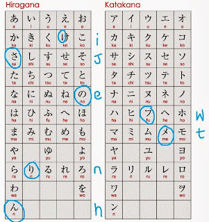

I then decided to incorporate a flower into the end of my name to give it that nature aspect. I decided on a water lily because its one of my favourite flowers. It's placed behind the ER of my name to put emphasis on JENNY, the nickname all my friends call me. Look carefully and you'll see.


Conclusion

It then came down to animating. I thought it would be nice to do a stop motion of a origami flower and then move onto revealing my logo on Adobe After Effects. First problem I had was learning how to make origami. I've never done it before, so I failed miserably when trying to make several different kinds of flowers till I finally came across one I could make! Now I'm a master of origami flowers (kinda) BUT animating the whole thing was a complete and utter failure. I'm even too ashamed to put it up on this blog! I ran into constant technical problems till the due date arrived and I couldn't finish/ fix it properly.
    Anyway, the tutors often say not to dwell on your animations and let go and move on and thats what I plan doing haha.... ugh but seriously what a failure!!!! The shame of it aaaaaall!!!!!

 but yeah I'll do better for the next project!!!!!!!!!!!!!!!!
I'm happy with my logo though and I also learned a lot so it's not all bad!

Summer Project Back to the Future Animation


I made this animation on Adobe Flash. I hand drew everything on the drawing tablet and came across countless problems due to my lack of knowledge of the software. But! I'm proud of this attempt and learned an incredible amount. I spent most of my time looking up tutorial videos on how to do stuff but I kind of managed in the end, although I do know it's not perfect and is a bit glitchy in places
...I'll try make my next animation better and learn from my mistakes!!! 

Tell me what you think! :)
Enjoy!